|
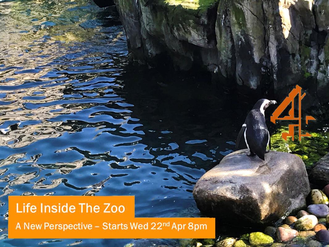
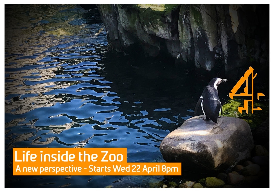
After receiving audience and teacher feedback for our advert. We made a few changes, the top one is the before changes photo and bottom photo is the after changes Changes we made:
0 Comments
Below shows the process of making advert Idea 2.  Below is the ideas we had for Idea 2 - again we decided to experiment with one in Black and White.  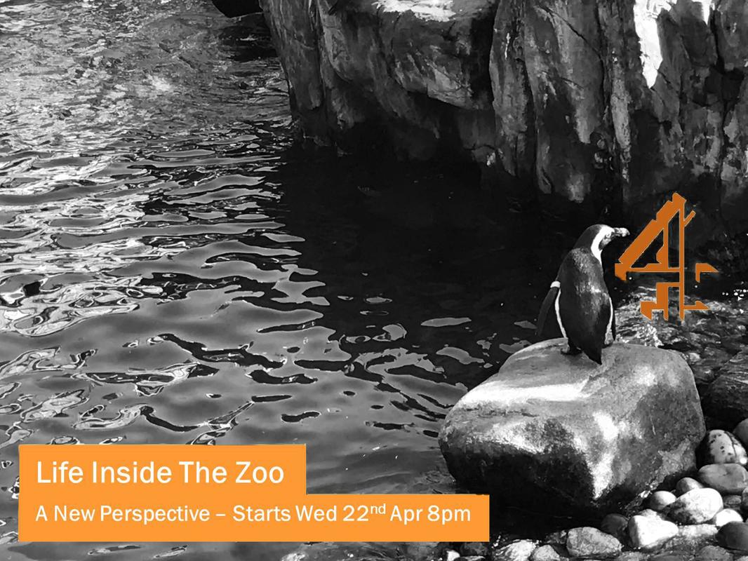 This is the photo of the avenue of Bristol Zoo. We liked this picture and used it because it shows the Zoo is a tourist attraction with people walking down it - it is a possible idea however we want the focus to be the animals for the documentary so we have worked on another idea as well. Also we experimented this with black and white to see the differences and variation. 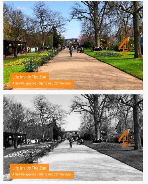 We continued to research the advert and looked at Channel 4 style models of the adverts they use for their documentaries. Using the same font we worked on our title for the advert. 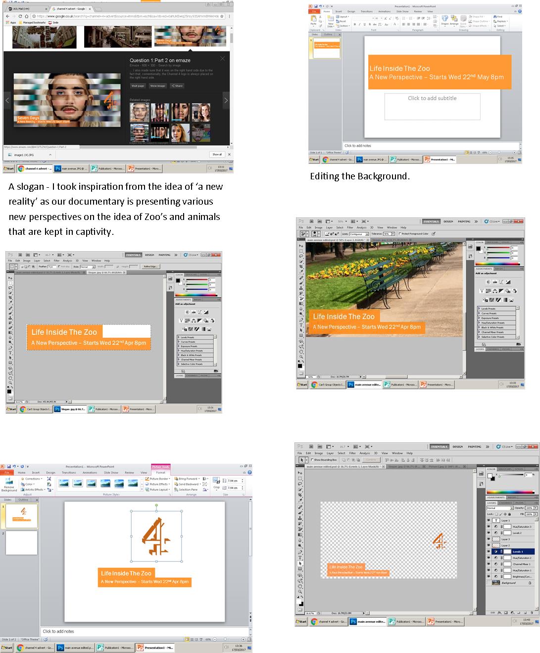 This is the beginning of our making of our Advert piece. We specifically got certain pictures for our advert (and DPS) whilst we re-visited the Zoo last week. 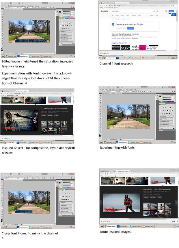 After careful research and planning with Elise and we decided that the 'National Geographic' magazine double page spread would be the best inspirational template for our documentary. This is due to the aesthetic composition and relation to the main focus being the image. Even though the DPS follows the general conventions of magazine spreads using large title's and Drop Letter columns, the over-all appearance has a sophisticated simple look. A bit of background on National Geographic Magazine; National Geographic is the official magazine of the National Geographic Society. It has been published continuously since its first issue in 1888, nine months after the Society itself was founded. It primarily contains articles about science, geography, history, and world culture. The magazine is known for its thick square-bound glossy format with a yellow rectangular border and its extensive use of dramatic photographs. 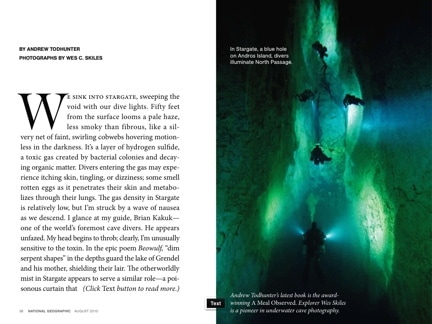 One of the most profound and constructive ways to advertise and present a documentary is through various features such as Television Adverts/Large Posters and Double page spread features that create an intriguing insight into the full product. The Product for this Double Page Spread is : Documentary - 'Life inside the Zoo' which we have designed to be presented like a series - specifically studying Bristol Zoo and their care for animals in captivity and what they oppose to negative representation around animals in captivity around the world. The below examples show the variety of Double Page Spreads so we decided to pick just one as inspiration. When producing a double page spread our main task was researching a well-known, aesthetically fit for purpose published magazine that could be of inspirational to us and relate to our project. British/American branded magazines gave a variety of different options such as: Hello Magazine Example: 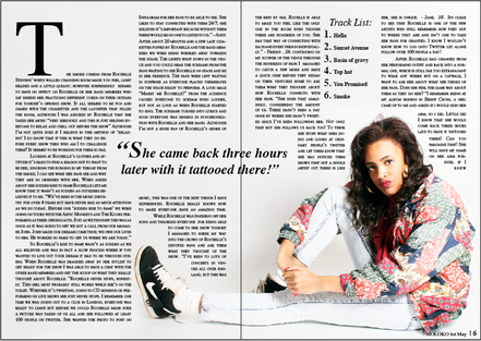 OK Magazine  National Geographic Example: 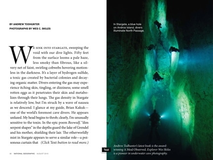 New York Times Example 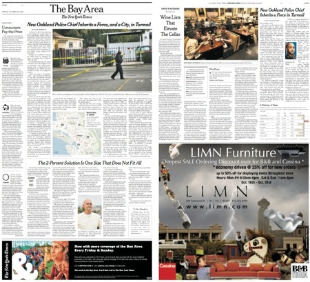 RadioTimes example (analysed these in previous posts) 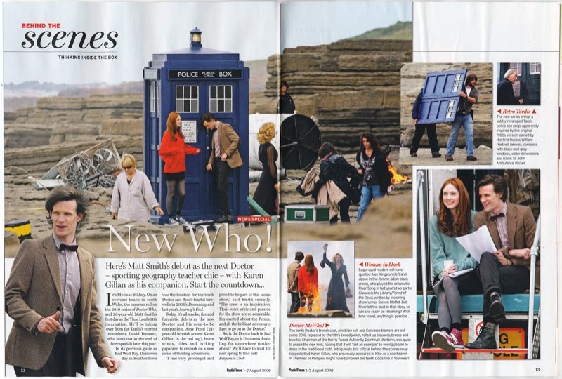 |
AuthorDan Ayers - Media Studies A Level Blog 2016/17 Archives
April 2017
Categories |
 RSS Feed
